
Context
Aspire Software was founded in 2013 with a single product: a cloud-based business management platform for landscape companies. Over the years, it grew by expanding into new verticals and acquiring additional products.
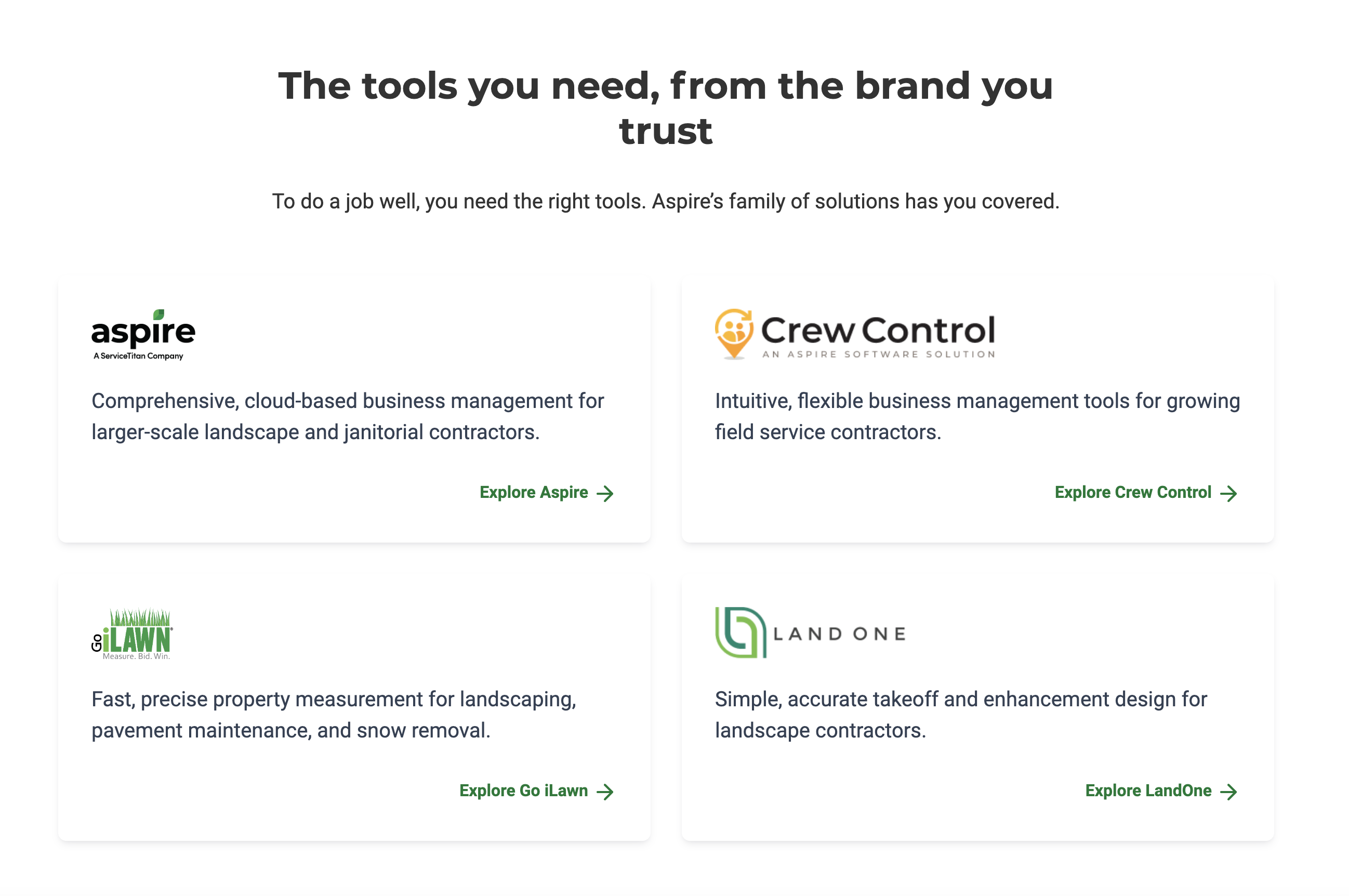
By the time I transitioned to managing website experience in 2022, Aspire had four discrete products targeting multiple industries within the broad “field service management” category.

My task was finding a way to incorporate all products and industries on a single Aspire website in a way that met the needs of users, internal stakeholders, and search engines—and looked great doing it.
Information Architecture
Addressing the site's information architecture was the first step in the process. With an approach informed by OOUX, I identified the types of content needed on the site then explored strategies for organizing that content.

Through a series of conversations with marketing leadership and other key players, I was able to create and iterate on a sitemap that addressed these needs.

One of the results of this process was separating industry and product (which were previously intertwined) into separate sections of the site. This marked a significant departure from how content was presented in the past, so our priorities in handling the shift were to:
- Ensure a seamless, clear browsing experience for all users
- Prevent any confusion or frustration from users and stakeholders already familiar with the site
We accomplished this by:
- Creating industry-agnostic product pages
- Setting up product-specific pages for things like features, pricing, and integrations (nested under their appropriate product pages)
- Making design choices to prioritize clarity in the content and UI
We collaborated closely with SEO partners throughout the IA process. One of the key strategies we found to solve for their needs included creating high SEO value, industry-specific feature pages. These could incorporate one or more relevant products, using a product badge design to show the functionality available for each.
With this new information architecture in place, we prepared Aspire for whatever the future holds, whether that means entering new verticals with existing software or acquiring new solutions.
New Product Match Form Experience
Another problem with the original site was the primary call to action, "Request Demo." This CTA worked perfectly when Aspire was a single-product company, but it no longer addressed our needs as a multi-product company.
Each product had its own CTA—either request a demo or start a free trial. Those CTAs could be found on their relevant product pages, of course, but what if a user wasn't sure which product was right for them? Or a page included multiple products and one primary CTA? And what were we supposed to do with the button in the global nav?
My solution was to create what I called a "product match form" experience. This form allowed users to identify the solution that worked for them and take the appropriate next step, all by answering just a few basic questions. Logic on the backend matched answers about revenue, industry, and software needs to the right product and directed submitters to take immediate action: scheduling a meeting or signing up for a free trial.

Design System
There wasn't a design system in place when we started, so building one from scratch was the longest phase of the process.
We enlisted the support of an external agency, where our primary team included a designer, two developers, and a SCRUM master. Working in two-week sprints, over the course of a year we created a fully-fledged design system with the pattern library in Figma and the components built in HubSpot.

Key Learnings
Every major website project involves lots of moving pieces and stakeholder requirements. This process was no different and gave me an opportunity to practice leading an initiative with multiple (often seemingly conflicting) goals. The solution I found most helpful was staying in regular communication with all stakeholders, investing in brainstorming alternative ideas when goals did conflict, using lots of visual aids (wireframes, mind maps, etc.), and clarifying roles and opportunities for feedback throughout the process.