
Design Process
Discovery
I started with an audit of Startup Week’s existing website, which they inherited from an organization that used to run the event. I documented the site’s current content and calls to action, then met with event organizers to discuss their pain points.

The key challenges were:
- Organizers weren’t able to easily edit the site’s content, which had to be updated every year
- The registration process needed to be streamlined to accommodate attendee engagement patterns (picking and choosing which sessions to drop in for throughout the week)
- The site needed more robust, compelling content to attract attendees
During this phase, we were also able to identify technical requirements (integrations with Mailchimp and Sched, for example) and prioritize goals for the new site.
Structure
The next step was to define the overall information architecture and sitemap. Knowing the site’s primary goals (helping entrepreneurs feel confident and excited about the event + encouraging local companies to recognize the value of sponsorship), it was easy to identify the types of content we needed and how they should be organized.

The new sitemap:
- Added a “Get involved” section to highlight opportunities for speakers and volunteers, in addition to sponsors
- Replaced the former “Press” page with a more robust Resources section that included a new blog and a place to share photo galleries and recordings from past events
- Created a scalable structure for adding conference years, events, team members, and locations
- Introduced landing pages to package and repurpose recordings from past years as lead generation tools
With the sitemap in place, I created an object model. An object model (inspired by Sophia Prater’s work in OOUX) helps you build a scalable structure around core content types and how they connect to one another. For Startup Week, the “objects” we found were:
- People (presenters and event organizers)
- Years (annual weeklong conferences composed of “Events”)
- Events
- Locations
- Recordings
- Sponsors
- Photo galleries
- News articles
- Blog posts
After identifying the objects, I built a model to define the relationships between them, and attributes associated with each.

Each of these objects eventually became a collection in Webflow so event organizers could easily add, edit, and remove collection items in the CMS (content management system) and watch them dynamically update across the site.

Wireframing
With the new structure finalized, it was sketching time. By starting with low fidelity, hand-drawn wireframes, it’s easy to explore lots of ideas quickly—iterating on ones that work and trashing ones that don’t.


As a very digital person, my favorite way to ideate is sketching in the Concepts app on my iPad. While the experience is the same (for me) as drawing on paper, I can move things around quickly and easily—and when it’s time to get into Figma, I’m able to export my final sketches as an SVG and drop them into their own Figma page for reference.
Designing in Figma
I use atomic design language to describe my work in this section. It’s an approach pioneered by Brad Frost in the early 2010s that breaks designs into smaller pieces that can be reused and combined for efficiency and scalability.
To create Startup Week’s design system, I began with the most basic elements (typescales, colors, icons, logos, etc.) before moving to atoms (buttons, dropdowns, etc.), molecules (form fields, list items, etc.), and finally organisms (cards, modals, etc.).

Equipped with the wireframes and object model, I built out the rest of components and screen designs.
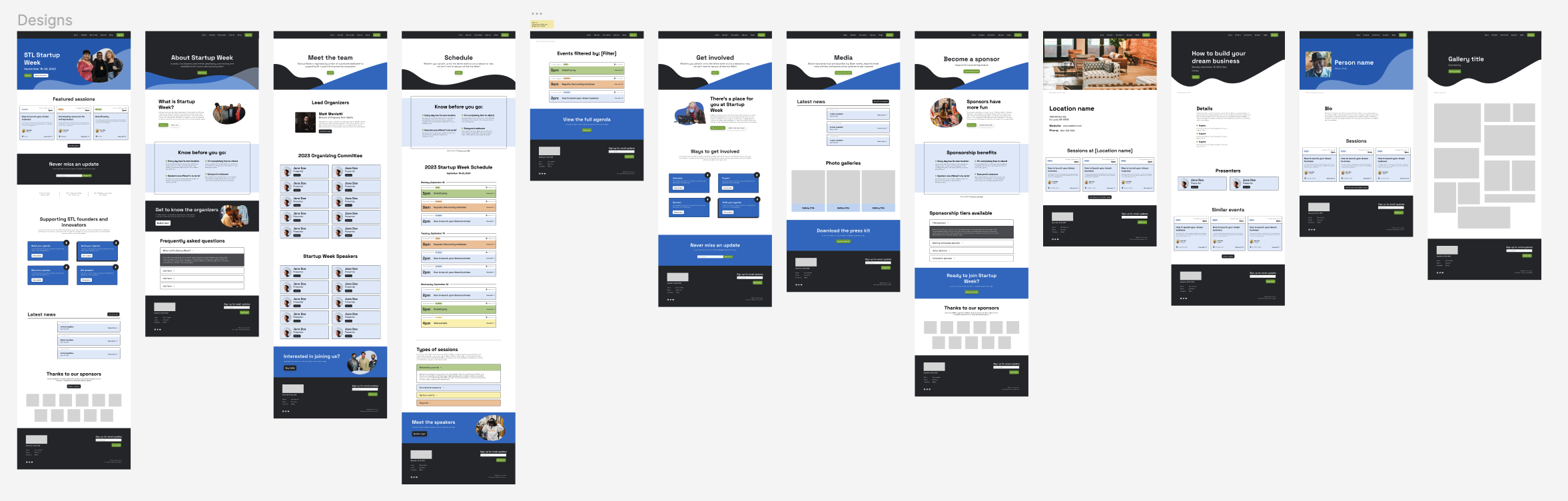

In addition to the main pages in the site’s structure, this included “detail” or template pages that would be autogenerated in Webflow every time an event organizer added an item to a collection.

To make it easier for users to find and choose sessions to attend, I created color-coded tags for each event category (educational, networking, partner, and keynote). This allows users to quickly scan a list, referencing background colors and/or tag labels. I also added an accordion legend to describe what guests could expect from each type of event.

Thanks to Webflow’s collection model, each of these instances can be populated dynamically when new content is added to the CMS.
During this phase, I also designed all of the graphics you see on the site, including hero backgrounds and spot images. This work was done primarily in Adobe Illustrator.
Developing in Webflow
The final step was building the site in Webflow. I use the Client-First method developed by Finsweet when building in Webflow. It's an approach to page structure and class naming/styling that helps projects stay organized, fluid, consistent, and responsive.
I'll keep this part of the case study brief, even though it was one of the more time-consuming phases. My process was essentially:
- Build all of the design system components and save them as symbols for re-use
- Build out each key page from the components + any unique elements that need to be created
- Build the detail pages for each published collection (events, people, locations, etc.)
- Make it all responsive (this involves lots of jumping back and forth between pages and breakpoints)
- Fill out SEO metadata and Open Graph content for all pages
- Finalize static copy across site (e.g., everything not tied to a collection)
- Populate the CMS with content for 2023, including speaker and committee members and event details
- Set up integrations with email marketing and event management platforms
- Test, test, and test some more
- Review by stakeholders + small revisions
- Go live!
CTA Collection
One final piece of the project I'll mention was the creation of a Webflow collection for Startup Week's main calls to action (CTAs). This required a little more setup work, but it will allow organizers in the future to update their most important CTAs (register, sponsor, become a speaker, sign up for emails) in one place and watch them update dynamically across the site.
I accomplished this by:
- Creating a Webflow collection with the basic fields name, URL, and button text
- Populating the collection with four main calls to action
- Creating buttons on the style sheet for each CTA, linking them to the collection, and turning them into symbols
- Adjusting button groups in key places on the site (global nav, footer, heroes, conversion panels, etc.) to use those symbols
Note: If you're a Webflow user, you'll know I'm simplifying this process. If you're curious about using it for one of your own projects, let me know and I'll give you the full rundown.
Conclusion
This project was a significant undertaking, but I loved seeing it all the way through from start to finish. My favorite part, as usual, was having the chance to learn and experiment with new tricks and approaches to solve problems along the way. The folks at Startup Week were wonderful to work with, and I can't wait to see what this year's event has in store.